en
A customer approached me with the task of designing a logo for the oil and gas production division (OGPE) of the Vietsovpetro joint venture.
The wish was to make a black background - oil as a base. On the left side of the logo, place a sign, inside of which, like the heart of the enterprise, is the platform. Pixel logo with 81 dots - the year of birth of the Vietsovpetro joint venture. The number of points can be increased, up to 87 - the year of birth of PDNG. Keep the colors of the company and the Russian and Vietnamese participants.
The platform can be simplified. Save the letter “E” in the abbreviation PDNG, as a “drop-down menu” icon.
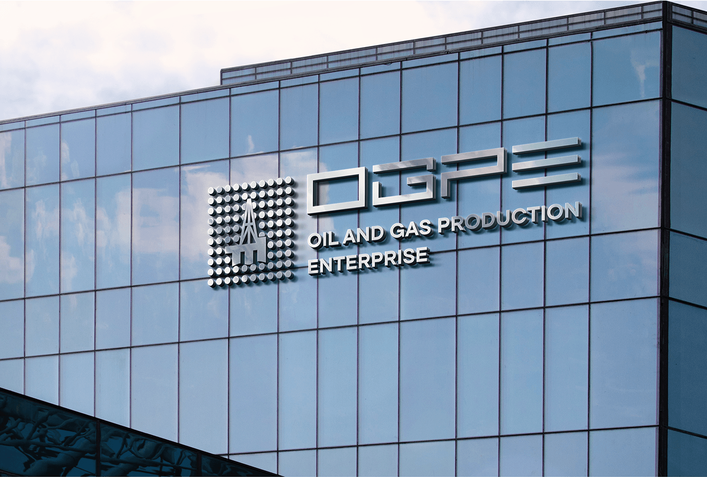
The logo must be clearly legible on any medium,
printing of varying complexity, including small,
as well as web.
ru
Ко мне обратился заказчик с задачей проработать логотип для подразделения по добыче нефти и газа (ПДНГ) СП «Вьетсовпетро».
Пожеланием было сделать черный background - нефть, как основа. В левой части логотипа разместить знак, внутри которого, как сердце предприятия - платформа. Пиксельный логотип с 81 точкой - год рождения СП "Вьетсовпетро". Количество точек можно увеличить, до 87 - год рождения ПДНГ. Цвета компании и Российского и Вьетнамского участника сохранить.
Платформу можно упростить. Букву «Е» в аббревиатуре ПДНГ, в виде значка «выпадающего меню» сохранить.
Логотип должен четко читаться на любом носителе,
полиграфии различной сложности, включая мелкую,
а так же web.
en
After a short brief that I offered to the customer, many questions were clear.
And I got to work.
After studying the niche and analyzing the target audience, I developed a logo concept within 5 working days.
We then agreed on several options and chose a color palette.
After several edits, we approved one of the versions. I provided the original working files for printing and web (pdf, eps, svg, png, jpg) within 24 hours.
And as a result, we see a well-packaged project that satisfies the customer’s needs and reflects the underlying meanings.
ru
После небольшого брифа, который я предложила заказчику, были ясны многие вопросы.
И я приступила к работе.
Изучив нишу, сделав анализ целевой аудитории, я разработала концепцию логотипа в течение 5 рабочих дней.
Затем мы согласовали несколько вариантов и выбрали уветовую палитру.
После нескольких правок мы утвердили одну из версий. Я предоставила исходные рабоиче файлы для печати и web (pdf, eps, svg, png, jpg) в течение суток.
И как результат, мы видим качественно упакованный проект, удовлетворяющий запросам заказчика и отражающий заложенные смыслы.

en
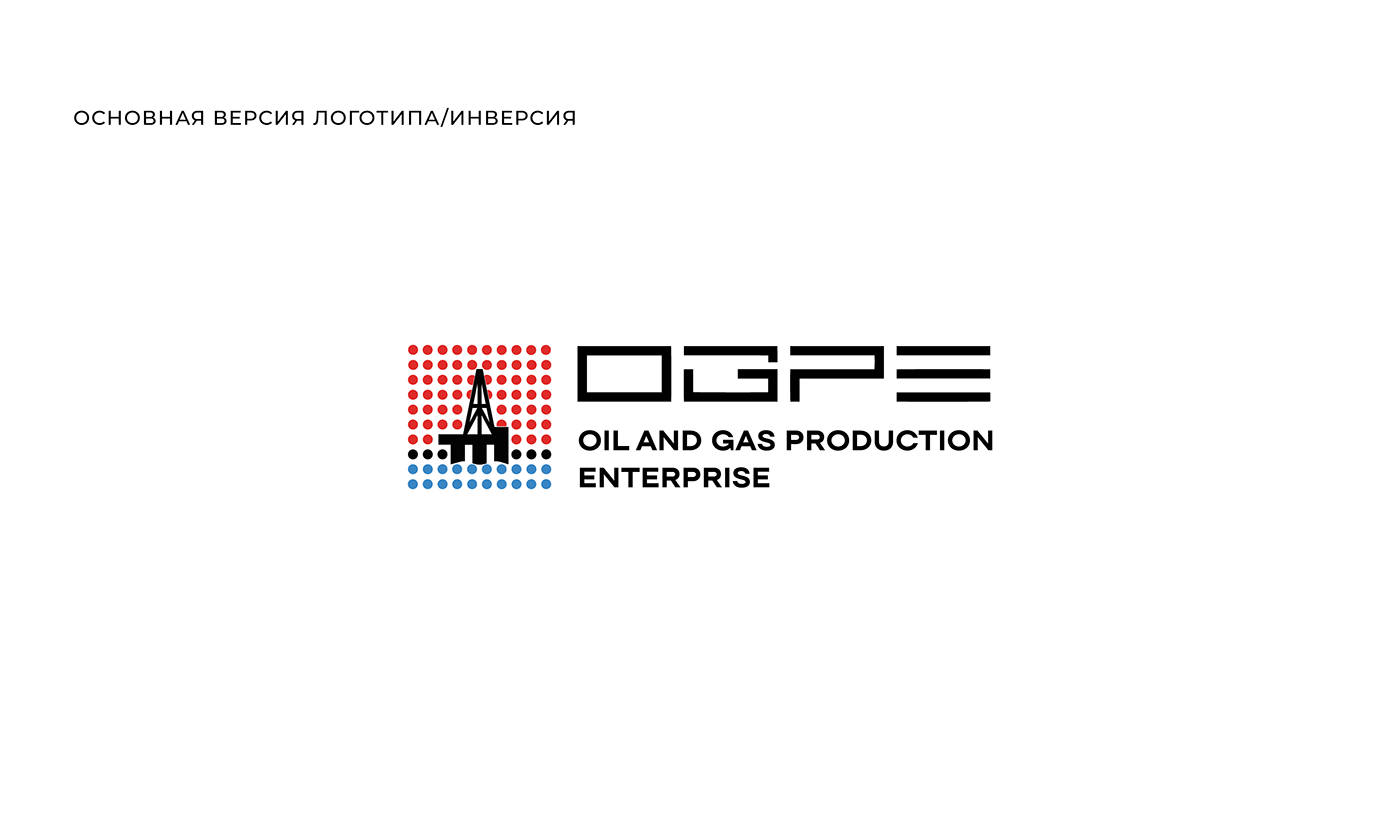
A strict geometric style is adopted as the basic basis, with visual interaction with which the impression should arise
technological fundamental enterprise.
The logo is a set of squares that fit neatly into a rectangle.
The descriptor fits into the title. The height of the sign corresponds to the height of the inscriptions.
The width of each pixel of the character corresponds to the size of the width of the main title of the OGPE letters.
The number of pixels is 87 units, which corresponds to the date of birth of PDNG.
The colors are open, strict, seasoned.
ru
За базовую основу принят строгий геометричный стиль, при визуальном взаимодействии с которым должно возникать впечатление
технологичного фундаментального предприятия.
Логотип представляет собой набор квадратов, четко вписывающихся в прямоугольник.
Дескриптор вписывается в название. Высота знака соответствует высоте надписей.
Ширина каждого пиксела знака соответствует размеру ширины основного названия букв OGPE.
Количество пикселей равно 87 единицам, что соотвествует дате года рождения ПДНГ.
Цвета открытые, строгие, выдержанные.